Key Takeaways
- Matching scale and proportion correctly is foundational for design that feels right in a space.
- Original design means avoiding simply replicating mass‑produced trends and instead creating spaces that reflect the individual.
- Paying attention to these “pitfalls” helps elevate a home from simply styled to deliberately meaningful.
Inside a Designer’s Mind | Pitfalls of Design
As we have quarantined at home, so many of us are taking a look at our spaces and wondering how we can change our spaces for the better. After all, now there is finally time to get around to our home improvement projects. And kudos to wanting to make a change.
It is proven that taking control of our environment and making positive changes improves our mental health according to Graham, Gosling and Travis in 2015. But as you dive in with a drill or a paint brush, let’s make sure you are avoiding the common pitfalls of design.
I would like to help you avoid some common mistakes that I’ve encountered and give you a viable alternative. Over the many years that I’ve been in design, I see three common threads that stand out as pitfalls; scale, proportion and originality.
SCALE
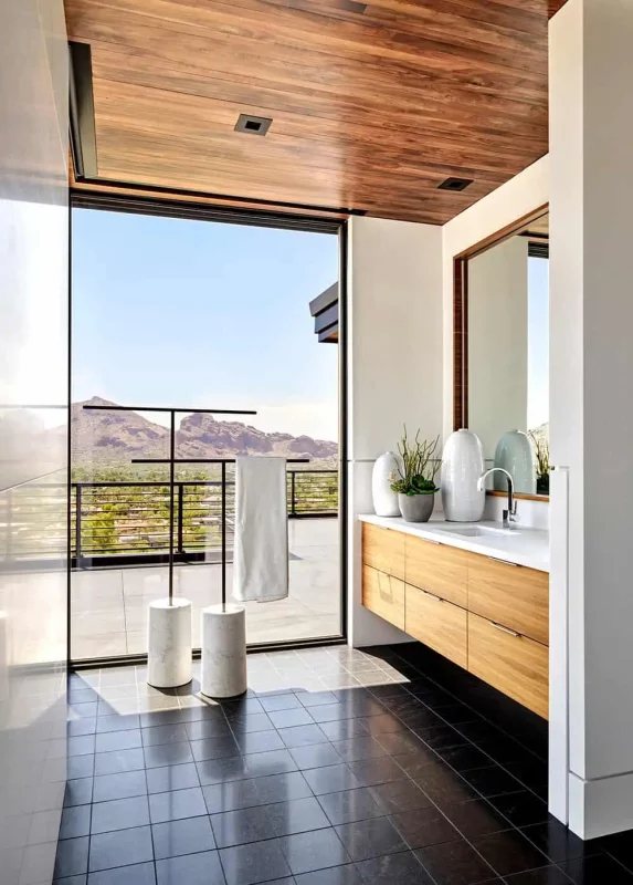
Scale and proportion can be talked about together, because they are similar concepts that relate to one another. The scale of an object refers to its overall size. Whether you have a large, open space with lots of volume, or a small, cozy setting, the furnishings need to feel appropriate and reflect the scale of the space.
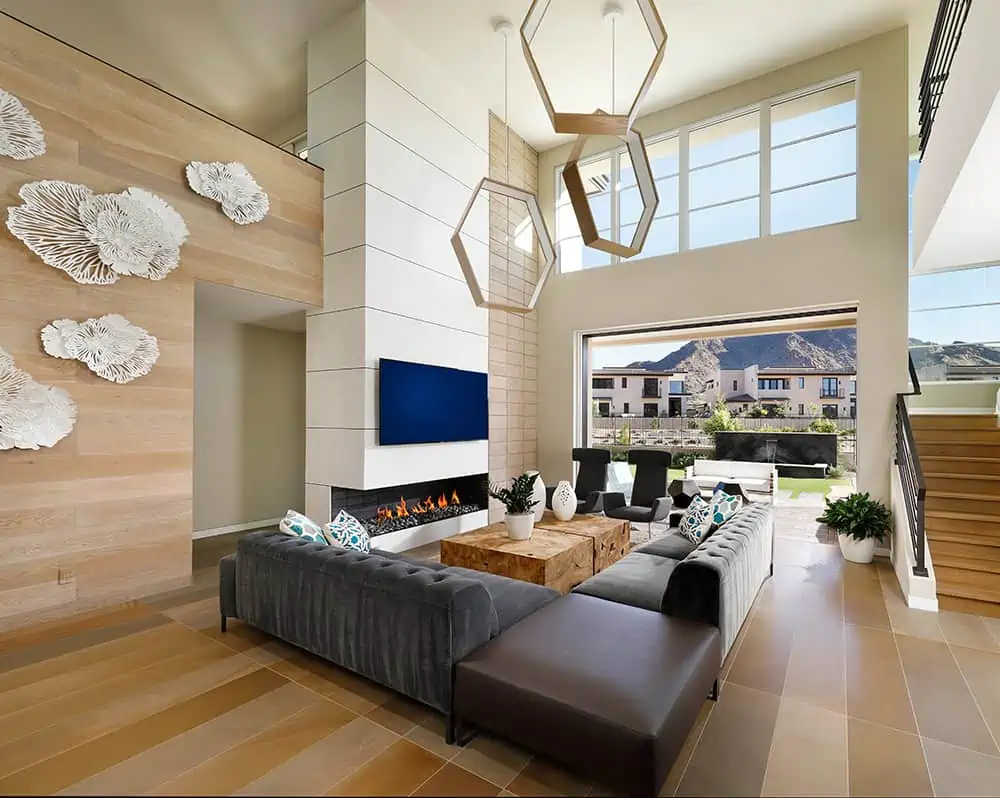
Fitting furnishings into a smaller space is usually the first thing that comes to mind, but just as commonly I see large spaces with furniture that becomes diminished within the overall composition. Utilizing larger furnishings that have strong massing can anchor an open space and service as the foundation for the rest of the design.
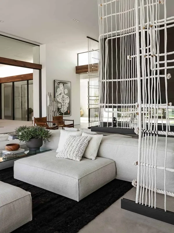
In oversized great rooms, which I often am challenged to furnish, I find it is best to anchor one larger sitting area that proportionately can still dominate the space, then add a secondary, and on occasion, a third. Dividing spaces directly in half is not nearly as successful, I have found. You can underscore your groupings by anchoring with some sizable furnishings; a sectional or large area rug can become heroes.
PROPORTION
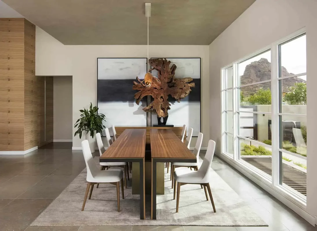
Related to scale, proportion is all about how one piece relates to another piece within a space. If one piece seems too small in comparison to another, or vice versa, it isn’t going to create cohesion in the space. For an easy example, let’s tackle an art piece over a fireplace or on a large wall over a sofa. A general guideline is to use the golden ratio (about two-thirds).
My advice when I doubt is to go big—I love using an oversized piece of artwork to really make a statement. It is better to err on the side of slightly over-scaled and to be bold. Another solution is to collect all the smaller pieces into one ensemble where the grouping then represents the correct proportion in the space. Avoid scattering pieces around the room, it is better to collect and focus the drama in one well thought out collage—a room needs negative space to avoid the business of clutter and eye fatigue.
A little note on scale and proportion, just to blow your mind… once you have mastered scale and proportion, then just for fun you can go back and break a rule successfully. Recently, I used a small piece of art on a large yet graphically stimulating fireplace surround. It’s one of the fun things of mastering a craft, you then get to break the rules!
ORIGINALITY
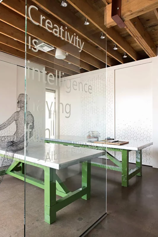
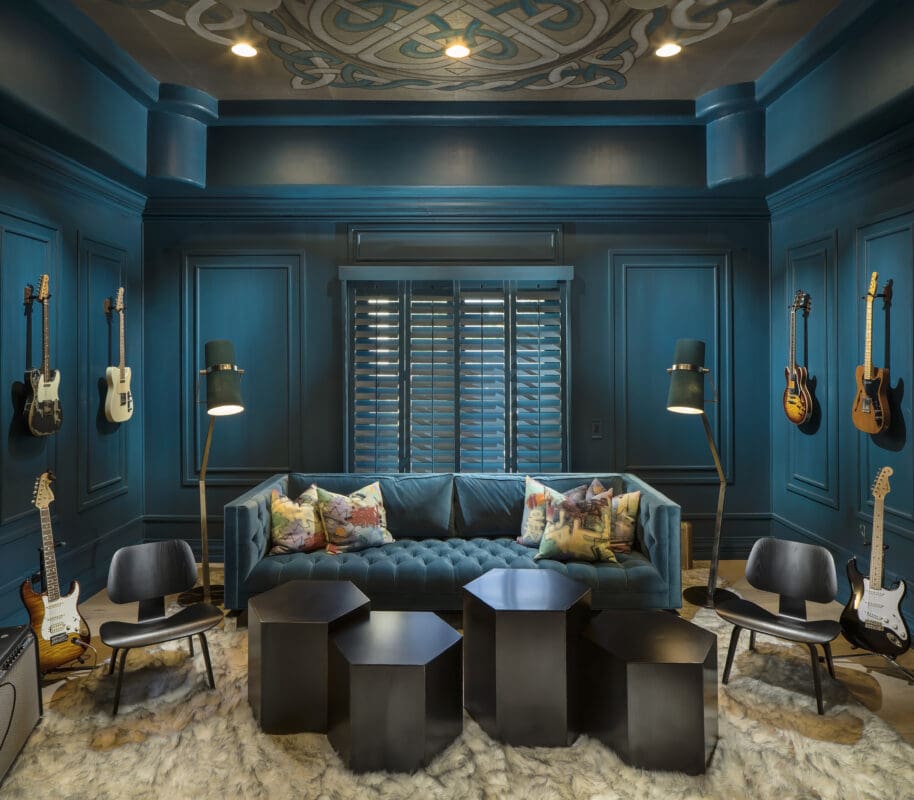
This concept is so important to design; as a creative, I am constantly open to new inspiration, new ways to execute a concept and try something different. Doing the same thing twice feels boring to me—where’s the fun in that? Each space and each client deserve a unique expression of who they are.
So often we see designs that all start to feel the same. We are inundated with the same trends, copied and pasted from Pinterest. How many homes have we seen that are gray and white, have Carrara marble or white modern farmhouse cabinetry? When buying a new home, you can feel pressured by the daunting task, so it may seem easy to go into a mass-produced furniture store and buy the whole room off the floor. What you end up with is a home that feels a bit soulless and redundant to your neighbor’s, instead of telling your own story.
Each of the families I serve are different; they each have different backgrounds, different preferences and different experiences, so each home is going to reflect their stories in a unique way. For me, every project feels like a new challenge and a chance to explore and grow as a designer.
Part of the inspiration is finding out the uniqueness of that client, their passions, heritage, collections and affinities. Do the same for yourself! Currently, in your home what makes you the happiest when you see it? Is it a piece of memorabilia from your childhood? Is it a color in your closet or a souvenir from a place you’ve once traveled? Or is it a certain shape or silhouette in a piece of furniture?
Let’s build on this—as a designer, I feel one of my biggest services is translating these sometimes-visceral emotions into a physical reality of evocative and meaningful spaces for my clients. Let design be a tool to create a space that uplifts your human spirit.
FAQs
- What is the difference between scale and proportion in design?
Scale refers to the size of an object in relation to the space (e.g., large furniture in a big room). Proportion describes how objects relate to each other (e.g., artwork size relative to sofa) so the composition feels balanced.
- Why does the blog say “originality” is a pitfall?
Because the danger is in mistaking trend‑copying for originality. When many homes follow the same look, spaces feel generic and lose client identity.
- How can a homeowner avoid the scale and proportion issues mentioned?
Measure the space and understand its volume first; then choose anchor pieces that visually fit the room’s size. For proportion, check how each major element relates to others—e.g., ensure wall art is about two‑thirds the width of the sofa when uncertain.
- Does avoiding these pitfalls mean I must avoid all current design trends?
Not necessarily. Trends aren’t bad—but they should be integrated intentionally and in service to the client’s story and space, rather than dominating it and making the home feel like everyone else’s.
- What is one practical step to make design more personal and less trend‑driven?
Identify one piece or element in your space that has genuine meaning (a travel souvenir, an heirloom, a favorite color) and build around it. This gives the space a unique starting point rather than beginning with a generic trend.


