
A scene from the 2003 film Big Fish unexpectedly brought up a memory for luxury interior designer Anita Lang. The hospital in the movie, meant to heal, felt more like a place of quiet discomfort.
“They had that really ugly, weird green, murky paint on the wall, and everything was so sterile.”
—Anita Lang
That moment, seemingly small, reinforces something central to her design philosophy: color has memory. When used without intention, it can disconnect us from the comfort that spaces are meant to provide.
Color Psychology Isn’t Theory—It’s Emotional Engineering
Color isn’t just decoration—it’s data. It’s a psychological tool, a biological signal, and in the hands of the right designer, it becomes emotional engineering. Anita Lang doesn’t just select colors that “go together”—she curates palettes that go deeper, speaking to the nervous system as much as the eye.
“Color is an immediate emotional response… psychology is huge… there’s so much study around the psychology of color.”
—Anita Lang
This awareness isn’t theoretical for her—it’s practical. And green, more than any other hue, exemplifies that duality: peaceful in one context, unsettling in another.
Just as Anita recalled the unsettling green of a 1950s hospital scene in Big Fish—a pale, sterile hue that evoked clinical detachment rather than healing—her designs prove that green can also do the opposite: calm the nervous system, signal vitality, and restore emotional balance—if used intentionally.
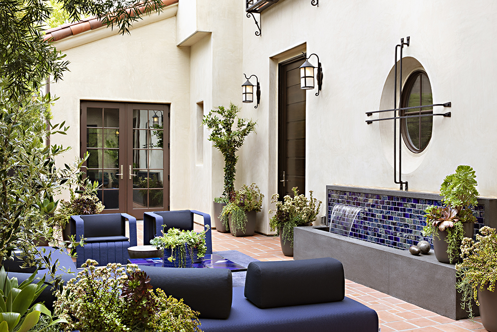
Anita might incorporate green through muted olive cabinetry, hand-glazed forest tile, or lush botanical upholstery that bridges comfort and luxury in living spaces. In spa and wellness environments, she often leans into sage, eucalyptus, or moss tones—colors associated with biophilia, a scientifically recognized principle that links nature with well-being.
These greens don’t shout—they settle. They’re never the focal point, yet they’re often what clients remember most about how the space made them feel.
Used with the wrong saturation or in the wrong lighting, green can feel acidic, artificial, or uninviting. But when applied with care—as Anita does—it becomes the very thing that makes a room feel like a sanctuary.
The Case for Green: Nature, Nuance, and Neural Response
“Natural tones of greens and blues have a soothing effect because they connect us to nature and the restorative calm that comes with it.”
—Anita Lang
This alignment with biophilic design—a design approach grounded in our human need to connect with nature—is more than philosophical. Studies show that exposure to natural greens can reduce cortisol, stabilize heart rate, and promote neurological relaxation.
Research on forest bathing, or Shinrin-yoku, offers compelling evidence. Originating in Japan, forest bathing involves immersive, meditative time in forest environments to promote physical and mental wellness. One of its most potent elements is the visual saturation of green, the dominant hue in forested landscapes.
A study published in the International Journal of Environmental Research and Public Health found that participants who engaged in forest bathing showed significantly lower blood pressure and heart rates than those in urban environments. These benefits were tied not just to the quiet or fresh air, but specifically to the visual experience of being surrounded by greenery—a color long associated with stability, healing, and cognitive restoration.
Green is also central to Attention Restoration Theory, which posits that natural environments—especially those rich in organic, unbroken greens—help restore depleted mental focus and reduce stress.
Forest bathing has become a widespread wellness practice in places like Sedona, Arizona, renowned for its red rock vistas and pine forests. In a project Anita worked on in Sedona, her design philosophy aligns with the region’s restorative landscape. Through a careful layering of texture, natural light, and green tonalities, she echoes the serenity found in nature and brings it indoors.
“You turn a green into a neon green, and it’s a different effect.”
—Anita Lang
In other words, the shade matters. Soft sage? Calming. Acidic neon? Jarring. Saturation, tone, and contrast are emotional dials—Anita simply knows how to adjust them.
Applying Color to Real-Life Healing Spaces
Anita’s belief that color holds emotional weight isn’t abstract—it’s applied, especially in spaces where emotional resonance is the goal.
In her work designing a holistic wellness clinic, she describes how every material and palette decision was chosen not only for function but also for emotional restoration.
“So when doing a clinic, you purposely try to heal people. So creating a soothing and therapeutic environment is a big component of the design work.”
—Anita Lang
She explains that not just color but texture and materiality contribute to comfort, an especially important consideration in clinical or high-performance environments where sterility often overwhelms warmth.
“Textures have to evoke warmth and comfort. They also have to be able to be washed and sterilized.”
—Anita Lang
Her choices reflect a holistic understanding of emotional design: soft but functional lighting, surfaces that feel inviting yet meet hygiene standards, and tonal color palettes—especially greens and blues—that soothe without slipping into cold, institutional aesthetics.
Designing for Emotional Outcomes
For Anita, design isn’t about filling a space but shaping a feeling.
In her view, luxury design doesn’t begin with materials or measurements. It begins with a conversation: What do you want this space to feel like? That emotional goal becomes the compass for the entire design journey.
“I work with discerning, elite clientele making significant investments in their homes. My role is to guide that investment with intention—so the outcome isn’t just visually stunning, it feels aligned with who they are and how they want to live.”
—Anita Lang
This intentional approach sets her work apart in the world of luxury interiors. Color, texture, and form are never used decoratively—they’re deployed with emotional precision.
Green, for example, isn’t just a peaceful hue. When layered correctly—through materials, tone, and context—it becomes a restorative experience. This level of intentionality transforms a space from beautiful to deeply personal.
Conclusion: From Murky to Mindful
Anita Lang’s recollection of that “ugly, weird green” in a mid-century hospital wasn’t just an aesthetic critique—it was a personal reminder of how powerful and lasting the emotional impact of color can be.
In her work, green is never used carelessly. It’s studied, softened, and sculpted into something more meaningful: an atmosphere that nurtures, restores, and reflects intentional living.
Whether in wellness clinics or private residences, Anita brings awareness to every project that color is memory, mood, and medicine. She doesn’t design for trends. She designs for the human spirit.
“Natural tones of greens and blues have a soothing effect because they connect us to nature and the restorative calm that comes with it.”
—Anita Lang
From forest floors to curated interiors, green, when thoughtfully applied, moves from sterile to soulful, from murky to mindful.