
Key Takeaways
- Symmetry brings order and calm; asymmetry brings movement, surprise, and personality.
- The richest interiors often layer both—using symmetry as anchor and asymmetry as expressive accents.
- Mastery lies in understanding visual weight, restraint, and how to thoughtfully balance opposing forces.
Why Balance Matters in Interior Architecture
The human brain is instinctively wired to seek equilibrium – a trait rooted in our neurological need for predictability and our evolutionary drive to identify safe and stable environments 1. In interior architecture, balance is often the silent narrator of a room, an invisible force that dictates how a space feels from the moment you enter. A thoughtfully balanced space communicates harmony and stability, making us subconsciously feel safe, grounded, and at ease.
This foundational principle is primarily achieved through two design modalities: symmetry and asymmetry. Symmetrical balance, with its mirrored and predictable arrangements, creates a profound feeling of calm, order, and serenity. It’s the subtle anchor behind a restful bedroom or a formal dining space. In contrast, asymmetrical balance fosters a sense of energy, movement, and spontaneity. Understanding how to wield both is the key to creating spaces that don’t just look beautiful, but feel unequivocally right.
Understanding Symmetry in Design
In interior design, symmetry refers to the balanced distribution of visual weight across a central axis or focal point. This principle is one of the most powerful tools for grounding a space in a sense of formality and timeless elegance. While there are several types, two are fundamental to our work:
- Bilateral Symmetry: This is the most familiar and intuitive form of balance. Also referred to as reflective symmetry, it involves mirroring objects or design elements across a central or vertical plane to create a bilateral composition. Think of a pair of armchairs flanking a fireplace or matching nightstands on either side of a bed. Bilateral symmetry evokes calm and predictability, making it ideal for formal or restful environments.
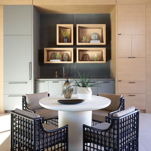
- Radial Symmetry: Here, visual elements radiate outward from a central point, like ripples in a pond or spokes on a wheel. Think of a circular dining table with chairs evenly spaced around it, a grand chandelier in the center of a domed ceiling, or the pattern of a custom-designed medallion on the floor of a foyer. Radial symmetry draws the eye inward and outward simultaneously, creating a sense of cohesion and dynamic focus.
While symmetry instills a sense of intention and structure, it can also create rhythm, guide movement, and establish emotional tone. When applied with nuance, symmetry becomes a quiet framework that allows other elements – texture, color, scale – to reassure the eye that everything is in its proper place, crafting a space that feels both resolved and deeply serene.
The Dynamic Appeal of Asymmetry
If symmetry is the language of order, asymmetry is the dialect of expression. Rather than relying on mirrored patterns, asymmetrical balance distributes visual weight through contrast, proportion, and tension. It’s what gives a living room an effortless sense of movement when a bold piece of art counterbalances a cluster of understated furnishings, or what makes a foyer feel alive when an oversized sculptural vase offsets the clean lines of a stairwell.
Asymmetrical design isn’t the absence of balance – it’s a more dynamic and skillful expression of it. This approach often feels more modern, more personal, and more fluid – inviting the eye to wander and the imagination to engage. When executed thoughtfully, asymmetrical design can highlight focal points, emphasize negative space, and create layers of visual interest that evolve as you move through a room.
This expertly orchestrated visual weight can transform what might otherwise feel like a hodgepodge of objects, scale, and texture into a cohesive, emotionally resonant environment. It’s ideal for spaces that aim to feel lived-in, expressive, or unexpected.
Combining Both for Rich, Engaging Interiors
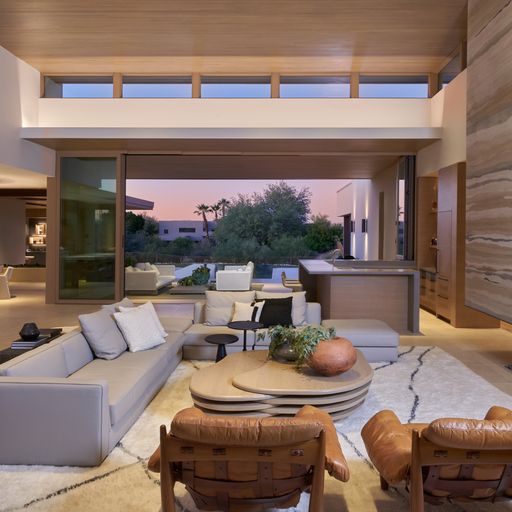
The most compelling spaces rarely adhere rigidly to one composition principle. Instead, they create a layered visual language that feels both intentional and alive. Imagine a living room where the core architectural elements – a central fireplace and flanking built-in bookshelves – create a perfect sense of bilateral symmetry. The primary furniture, like a sofa centered on the fireplace with matching end tables, reinforces this structure. This foundation feels stable and resolved.
Then, we can introduce asymmetrical accents to disrupt the perfect reflection: a trio of unique ceramic vases on one side of the mantel, a single, sculptural floor lamp beside the sofa, or an artfully draped throw blanket. These small, intentional imbalances break the formality, adding a layer of curated, lived-in character.
Design principles such as the rule of thirds and the 3-5-7 rule further elevate this balance. The rule of thirds divides a space into visual grids that guide the placement of furniture and artwork, preventing monotony while maintaining cohesion. Similarly, the 3-5-7 rule introduces asymmetry through grouping objects in odd numbers – a trio of pendant lights above a kitchen island, five staggered wall shelves, or a collection of seven decorative elements styled across a console table. These groupings create rhythm and flow, drawing the eye naturally from one focal point to another 2.
Avoiding Pitfalls of Overuse
Like any powerful tool, both symmetry and asymmetry must be wielded with intention and restraint. On one hand, overreliance on symmetry can drain a room of its personality. When each element is mirrored and each object is paired, the initial feeling of calm and order can quickly veer into something that feels formulaic, static, and lifeless. The space can begin to resemble a formal showroom rather than a personal sanctuary.
Conversely, poorly executed asymmetrical design can be equally unsettling. This usually occurs when the fine line between dynamic energy and visual noise is crossed. Without a clear understanding of visual weight – how form, color, and scale interact – an overzealous attempt at an artful composition can evoke a sense of chaos. When a room feels cluttered and visually jarring, the occupant tends to feel unsettled rather than energized, failing to provide the subconscious sense of equilibrium people naturally seek.
The key is a thoughtful, nuanced approach. True design mastery lies in knowing not just which principles to use, but when to rein them in to create an environment that feels perfectly personal and balanced.
Visual Weight and Human Perception
To master the interplay of symmetry and asymmetry, it’s important to understand the principle of visual weight. In design, each element in a room has weight – or the power to draw the human eye. Several factors contribute to this perceptual force that enables design elements to command attention:
- Size and Scale: Larger objects inherently have more visual weight than smaller ones. This is why a grand sofa will be a heavyweight anchor in a room’s composition.
- Color: Hue intensity and temperature carry immense weight. Bold, warm, and dark hues (like crimson, charcoal, or navy) are usually perceived as heavier than light, cool, and muted tones (such as beige, pale blue, or gray). This is why a single, small, vibrant red sculpture can easily balance a large, neutral-toned armchair.
- Texture and Complexity: A visually complex object demands more of our attention. A rough, highly textured surface like a chunky knit throw, a reclaimed wood table, or a detailed patterned rug will carry more visual weight than a smooth, plain, or glossy surface.
- Placement: An element positioned far from the central axis of a room will feel heavier and have more leverage. For example, placing a tall, arched mirror at the far edge of a seating arrangement can visually counterbalance a central fireplace, subtly expanding the perceived space while adding vertical tension and reflective depth.
Understanding how to leverage these elements is crucial because of how our minds are wired. Humans have a natural psychological bias toward symmetry because it’s easy for our brains to process. However, our brains also crave stimulation – a cognitive yearning for complexity. The quiet power of a perfectly weighted room satisfies these competing desires, providing an underlying sense of balance that feels harmonious, while offering enough visual complexity and interest to keep the mind engaged.
Architectural Approach to Balance
Balance is an experiential quality – the synthesis of structure and sensory detail working in concert to create a space that elevates, nourishes, and quietly reflects the soul of those who live, work, or socialize within it. “To achieve this, we lean on the philosophy of biophilic design to connect the built environment to the natural world. By emulating nature’s inherently balanced asymmetry, we create spaces that tap into our primal sense of well-being,” explains luxury interior designer Anita Lang.
This foundational principle comes to life in merging architectural order with organic elements. “For instance, we might design a great room with a central fireplace perfectly flanked by expansive windows that frame a landscape to provide a sense of grounding. Then, we might accentuate this framework with the organic pattern of a living green wall on one side; the asymmetrical veining of a massive, single slab of marble; or the shifting, dappled light that filters through a clerestory window,” says Anita.
These balanced anchors provide a sense of calm and order, allowing the more expressive elements to breathe. The result is a space that feels curated yet intuitive, structured yet alive.
Practical Application of Symmetry and Asymmetry
In one dining room project, the clients envisioned a space that honored the home’s traditional European architecture while injecting it with fresh and expressive design elements. We began by establishing a serene, symmetrical framework with traditional millwork, classic limestone floors, and elegant, floor-to-ceiling drapery panels flanking the paned windows. This symmetrical base created a sense of calm and order – a visual rhythm that grounded the room in architectural heritage.
To counterbalance this formality and infuse the space with personality, we layered in bold, asymmetrical accents. A monochromatic wash of sapphire blue enveloped the walls, setting a dramatic tone. An overdyed Turkish rug with an irregular pattern added movement and complexity. The client’s own dining chairs – revived with a dynamic, large-scale brushstroke fabric – became focal points of expressive contrast.
While the composition is anchored by a central, bespoke crystal chandelier, the room’s energy comes from the artful disruption of symmetry. These asymmetrical gestures invite curiosity and emotional engagement, transforming the space from classically composed to deeply personal.
How to Apply These Principles in Your Home
While symmetry and asymmetry may sound like abstract design theory, applying them at home can be surprisingly straightforward. The key is to think in layers – starting with structure, then refining through furniture, art, and accessories.
According to Anita, here’s a simple framework to help guide the process:
- Start with an Architectural Anchor: Identify the structural focal point of the room (this could be a fireplace, a large window, or a ceiling feature) and use this anchor to establish spatial rhythm and guide the layout.
- Choose Your Balancing Approach: Decide whether the space calls for more symmetrical balance or asymmetrical elements. Consider the space’s primary function and overarching emotional tone.
- Refine Visual Weight: Balance large items with clusters of smaller ones, or bold colors with neutrals. This keeps the eye moving while maintaining harmony.
- Apply Odd-Number Groupings: Style objects in sets of three, five, or seven to avoid rigidity and add natural rhythm. Whether it’s pendant lights, cushions, or art arrangements, odd numbers create natural visual interest and help compositions feel more curated rather than staged.
Remember, designing with balance isn’t about following rigid formulas. It’s about creating a space that feels intuitively right. When structure and expression are thoughtfully aligned, your space becomes a reflection of how you want to feel.
FAQs
- How do I decide between symmetry and asymmetry for my home?
Start by considering the emotional tone you want your space to convey. Symmetry creates a sense of calm, order, and predictability – ideal for rooms meant to soothe or restore, like bedrooms or formal dining areas. Asymmetry, on the other hand, introduces energy, movement, and personality, making it well-suited for creative zones, social spaces, or areas that benefit from visual dynamism.
The key is to align your choice with how you want the space to feel, and to remember that the most compelling interiors often blend both approaches in thoughtful proportion.
- What are simple ways to introduce balance using asymmetry?
Begin with visual weight. Pair a bold, textured object (like a sculptural vase or vibrant artwork) with quieter, more neutral elements to create intentional contrast. Use odd-number groupings (three, five, or seven) when styling accessories or wall art to add rhythm and spontaneity. Vary placement by offsetting key pieces slightly from the center, such as positioning a reading chair at the one-third mark of a wall rather than directly in the corner.
These subtle shifts create movement and emotional texture while maintaining a sense of cohesion.
- What is “visual weight,” and why is it important?
Visual weight is how much an object draws attention—based on size, color, texture, and placement. It’s critical for balancing elements across a room in both symmetrical and asymmetrical layouts.
- Is symmetry always better in formal rooms?
Symmetry often suits formal or restful spaces, but introducing subtle asymmetrical accents can soften rigidity and make them feel more alive.
- What’s a simple first step to apply these ideas at home?
Start by identifying a structural focal point (e.g. fireplace or window), then build around it—first symmetrically, then layer in asymmetric touches.